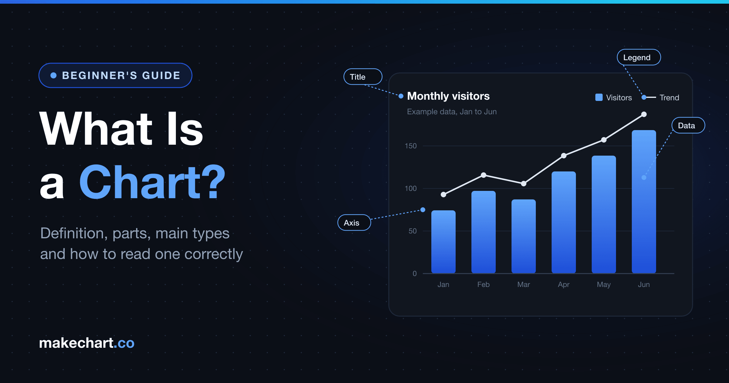
A chart is a picture of data. It turns numbers into shapes, such as bars, lines, dots or slices, so you can compare values, spot trends and catch outliers at a glance. A table makes you read every number. A chart lets you see the pattern first.
Charts are everywhere: in news stories, school reports, sales decks and dashboards. Yet reading them isn't automatic. In a survey published in 2015, Pew Research Center found that only 63% of U.S. adults correctly interpreted a simple scatterplot (The art and science of the scatterplot). Among adults with a high school education or less, only about half got it right.
This guide explains what a chart is, the nine parts most charts share, the main chart types and how to read one without getting fooled.
Key Takeaways
- A chart shows data by turning each value into a position, length, angle, area or color.
- People judge position most accurately and area least (Cleveland and McGill), so bar charts beat pie charts for precise comparisons.
- Only 63% of U.S. adults read a basic scatterplot correctly (Pew Research Center, 2015).
- Choose a chart by the question you're asking.
What Is a Chart?
A chart is a visual representation of data. The Society of American Archivists' Dictionary of Archives Terminology defines it as "a diagram or table intended to communicate information visually" (chart). In everyday data work, a chart turns numbers into bars, lines, dots, slices or colors, so patterns are easy to see.
Every chart works the same way underneath. It takes a value from your data and turns it into something your eye can measure. In a bar chart, a bigger number becomes a longer bar. In a line chart, it becomes a higher point. In a pie chart, it becomes a wider slice. Data visualization researchers call this mapping an encoding.
Our take: Chart names like "doughnut" or "treemap" are just labels. What decides whether a chart works is its encoding. Can a reader decode each value from the shape quickly and accurately? Once you think in encodings, choosing a chart gets much easier.
Here's a simple example. Suppose a shop sold 120 mugs in January, 150 in February and 90 in March. In a table, you'd read three numbers and compare them in your head. In a bar chart, February's bar towers over March's, and you get the answer before you've read a single label.
What Are the Parts of a Chart?
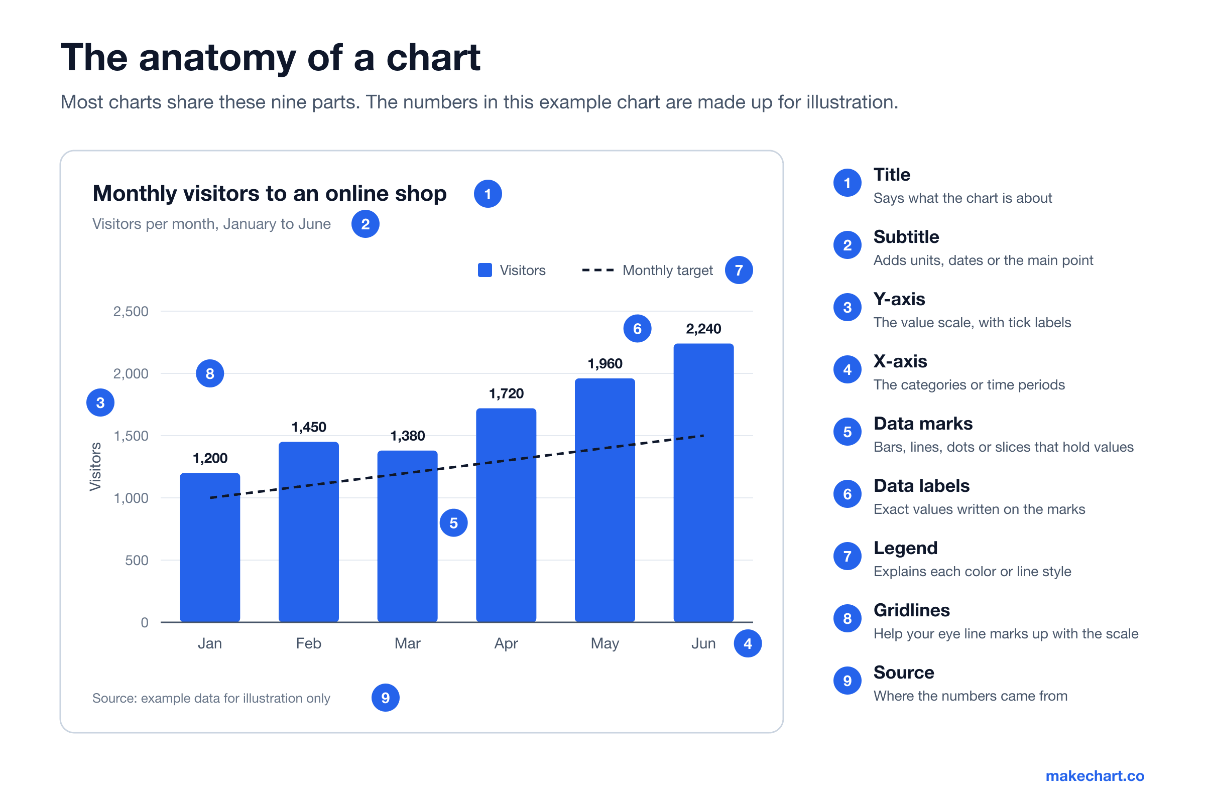
Most charts share nine parts: a title, a subtitle, two axes, data marks, data labels, a legend, gridlines and a source note. Statistics Canada's guide to using graphs says a good graph "has a title and labels" (5.1 Using graphs, 2021). The other parts help readers decode values without guessing.
Here's what each part does:
- Title. Says what the chart is about. A strong title states the main finding, such as "Visitors doubled in six months."
- Subtitle. Adds the units, the time period or other context a reader needs.
- Y-axis. The vertical scale that shows values, with tick labels like 0, 500 and 1,000.
- X-axis. The horizontal line that holds categories or time periods.
- Data marks. The bars, lines, dots or slices that carry the values.
- Data labels. Exact numbers printed on or next to the marks.
- Legend. Explains what each color, pattern or line style means.
- Gridlines. Faint lines that help your eye match a mark to the scale.
- Source. Where the data came from, so readers can check it.
Not every chart needs all nine. A pie chart has no axes, and a chart with data labels often doesn't need gridlines. But a title, clear labels and a source are close to mandatory. Without them, readers have to guess.
What's the Difference Between a Chart, a Graph, a Diagram and a Table?
For most people, there's no real difference between a chart and a graph. Quebec's official French-language office, the Office québécois de la langue française, notes that "most authors tend to use the terms graph and chart as perfect synonyms" and that "there is no consensus as to what the distinction is" (graphique statistique). Diagrams and tables are different things.
| Term | What it shows | Examples |
|---|---|---|
| Chart | Data in any visual form. Best for comparing values and spotting patterns. | Pie chart, bar chart, treemap |
| Graph | Data plotted against axes. Best for trends and relationships. | Line graph, scatter plot |
| Diagram | Structure or process, not necessarily numbers. | Flowchart, org chart, Venn diagram |
| Table | Exact values in rows and columns. Best for looking up precise numbers. | Spreadsheet, price list |
When people do separate the first two words, "graph" usually means data plotted on x and y axes, while "chart" is the broader term. So most graphs are charts, but not every chart is a graph. A pie chart has no axes, so purists wouldn't call it a graph. In everyday speech, though, "bar graph" and "bar chart" mean the same thing.
What Are the Main Types of Charts?
Four types cover most real-world charts. In 2018, a team of computer scientists analyzed more than 41,000 visualizations from five charting tools. They found that "the vast majority" were bar charts, line charts, scatter charts and maps (Beagle, CHI 2018). Pie charts made up less than 5% of charts in four of the five tools.
The fastest way to choose is to start with your question:
| Your question | Chart to try | Why it works |
|---|---|---|
| How do these categories compare? | Bar chart | Bars share a baseline, so differences in length are easy to judge |
| How did this change over time? | Line chart or area chart | The slope shows the direction and speed of change |
| What share does each part take? | Pie chart or doughnut chart | Slices show part-to-whole, best with five or fewer parts |
| Are these two things related? | Scatter chart | Each dot is one record, so clusters and trends appear |
| How are the values spread out? | Box and whisker chart | Shows the median, range and outliers in one shape |
| Where do people drop off? | Funnel chart | Each stage narrows as the numbers fall |
| How does it vary by country? | World map chart | Color shows the value on a map |
The first four rows cover most everyday questions. Not sure where to start? Try a bar chart. It's rarely the wrong answer. For the full list, see our guide to 14 chart types and when to use each.
Why Use a Chart Instead of a Table?
Charts reveal patterns that summary numbers hide. In 1973, statistician Francis Anscombe published four small datasets with the same averages, correlation and best-fit line. Plotted, they look completely different (Graphs in Statistical Analysis, The American Statistician, 1973). His lesson still holds: plot your data before you trust a summary.
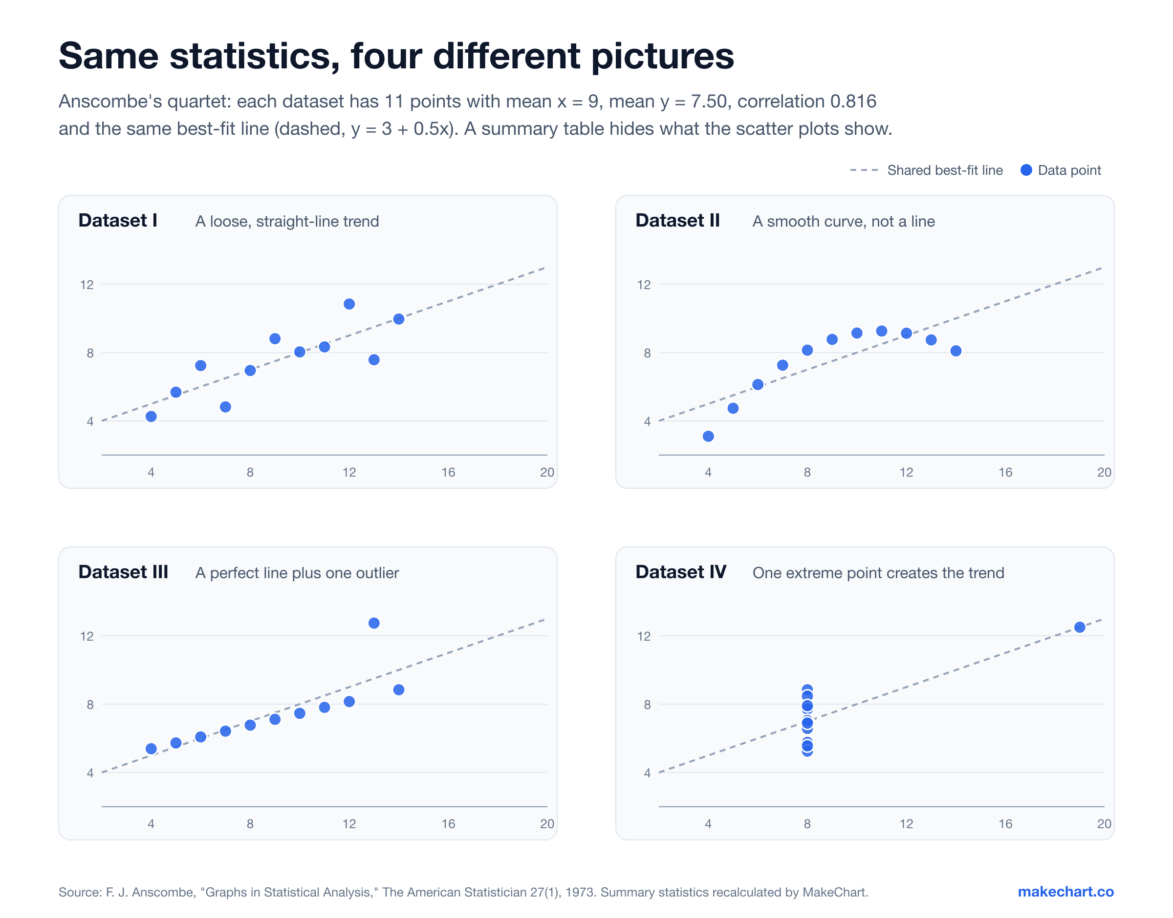
Look at the four panels above. Every dataset has 11 points, a mean x of 9, a mean y of 7.5 and a correlation of 0.816 (Frank Anscombe's Regression Examples, Duke University). A table of summary statistics would call them identical. The charts show a loose line, a curve, a tight line with one outlier, and a single extreme point creating the whole trend.
Charts also take advantage of how fast vision works. In 2014, MIT neuroscientists found that the brain can process an image seen for as little as 13 milliseconds (In the blink of an eye, MIT News). That study used photos, not charts, so you can't read a chart that fast. But a chart's overall shape registers before you read a single label.
Charts aren't always the better choice, though. If your reader needs one exact figure, like a price or a bill amount, a table wins. Charts are for patterns. Tables are for lookups.
Which Charts Are Easiest to Read Accurately?
Charts that use position and length are the easiest to read accurately. In experiments published in 1984 and 1986, statisticians William Cleveland and Robert McGill found that "two types of position judgments were found to be the most accurate, length judgments were second, angle and slope judgments were third, and area judgments were last" (An experiment in graphical perception, 1986).
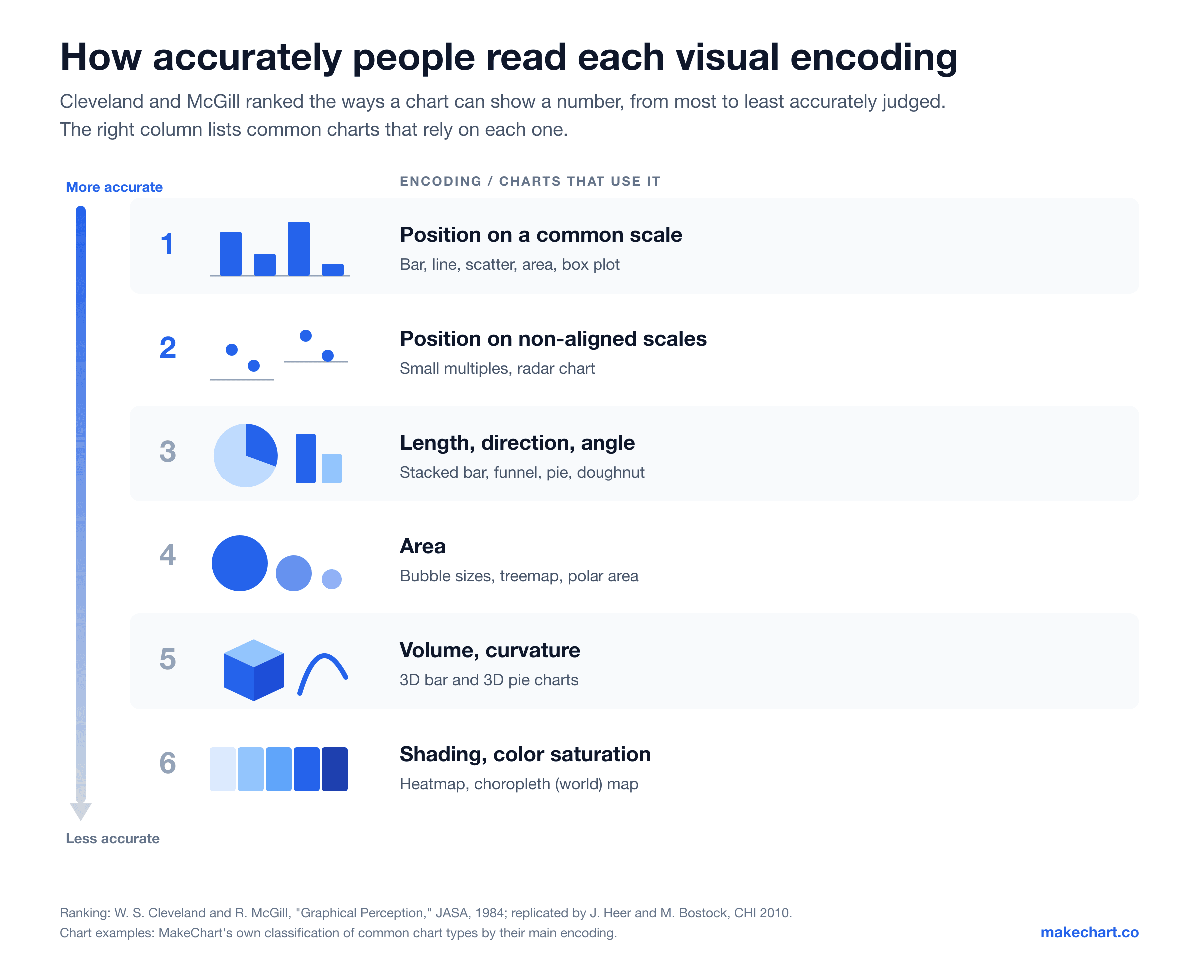
This ranking explains a lot of the chart advice you may have heard. Bar charts beat pie charts for comparing values because bars use position and length, while pie slices use angle and area. 3D charts are discouraged because they add volume and perspective, which sit near the bottom of the ladder (Graphical Perception, Journal of the American Statistical Association, 1984).
The finding has held up. In 2010, Jeffrey Heer and Michael Bostock repeated the experiments with crowdsourced participants. They found "the rough shape and ranking of judgment types by accuracy" was preserved (Crowdsourcing Graphical Perception, CHI 2010). One twist: angle judgments did no worse than length in their results. Judging circle sizes, as in a bubble chart, produced the biggest errors.
Our analysis: We sorted 14 common chart types by the main way each one encodes values. Six rely mainly on position: bar, line, area, scatter, box and whisker, and bubble (for its x and y values). One uses position on separate scales (radar). Four rely on length or angle (pie, doughnut, funnel and Sankey). Two rely on area (polar area and treemap). One relies on color (the world map). When precision matters, pick from the top of the ladder. When the overall story matters more than exact values, the lower rungs are fine.
Reading charts is also a skill, and not everyone has had the practice. In 2024, the OECD's Survey of Adult Skills reported that 25% of adults across OECD countries scored at or below Level 1 in numeracy (PIAAC 2023 International Comparison, CSO Ireland). In the United States, that share rose from 29% in 2017 to 34% in 2023 (NCES press release, 2024). Clear titles and labels aren't decoration. They're how you reach every reader.
Where Did Charts Come From?
In 1786, William Playfair published the first line and bar charts in The Commercial and Political Atlas. In 1801, he added the pie chart in his Statistical Breviary. Data visualization historian Michael Friendly of York University calls Playfair "the inventor of most of the graphical forms widely used today" (A Brief History of Data Visualization, 2006).
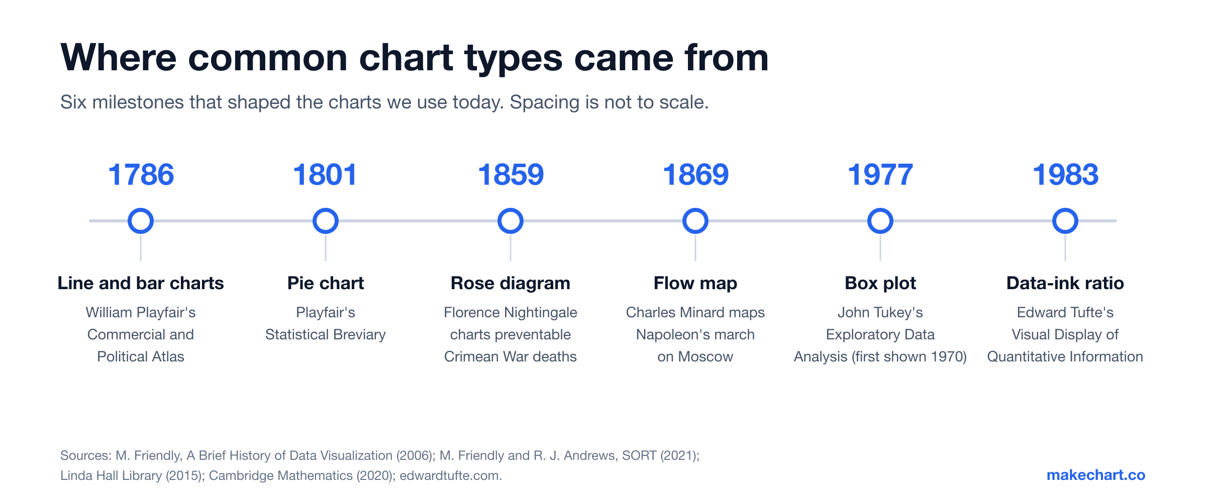
Charts soon proved they could change minds. In the late 1850s, Florence Nightingale used her "rose" diagrams to show that most British soldiers in the Crimean War died "not from battle, but from preventable causes" such as disease and poor sanitation (The radiant diagrams of Florence Nightingale, SORT, 2021).
In 1869, Charles Minard drew Napoleon's march on Moscow as a band that shrinks from 422,000 soldiers to 10,000 survivors (Scientist of the Day: Charles Joseph Minard, Linda Hall Library). Edward Tufte later called it "the best statistical graphic ever drawn."
The 20th century added tools for analysts. John Tukey introduced the box plot in 1970 and popularized it in his 1977 book Exploratory Data Analysis (The (box) plot thickens, Cambridge Mathematics, 2020). In 1983, Tufte's The Visual Display of Quantitative Information gave designers the idea of the "data-ink ratio" (edwardtufte.com).
How Do You Read a Chart Correctly?
Check what a chart measures before you judge what it shows. That order matters. In 2021, a team of psychologists found that truncated bar-chart axes misled 83.5% of participants across five studies, even after they'd been taught about the trick (Truncating Bar Graphs Persistently Misleads Viewers, Journal of Applied Research in Memory and Cognition).
Use these five steps every time:
- Read the title and subtitle first. They tell you what's being measured and over what period.
- Check both axes. What are the units? Does the value axis start at zero? On a bar chart, it should.
- Read the legend. Know which color or line means what before you compare anything.
- Find the big pattern. Look for the highest and lowest values, the overall trend and anything that breaks the pattern.
- Check the source and date. Old or unnamed data can make a good-looking chart useless.
Why does step two matter so much? Say two bars show 51 and 52, and the axis starts at 50. The second bar looks twice as tall, even though the real gap is about 2%. Visual warnings don't fully fix it either. In 2020, Michael Correll and colleagues found the effect persists "even for designs with explicit visual cues that indicate truncation has taken place" (Truncating the Y-Axis: Threat or Menace?, CHI 2020).
How Do You Make a Chart?
A good chart needs one question, two columns of data and a few rules. In 2025, the global data visualization market was worth an estimated $12.24 billion, according to Fortune Business Insights (Data Visualization Market report). You don't need expensive software, though. Follow these six steps:
- Start with one question. "Which product sold best last quarter?" fits in one chart. "Everything about sales" needs a dashboard.
- Put your data in two columns. Labels go in the first column (products, months, countries) and values in the second.
- Pick the chart from your question. Use the table above: compare, change over time, part of a whole, relationship or spread.
- Label everything. Write a title that states the finding, name both axes, add units and cite your source.
- Cut the clutter. Remove 3D effects, heavy borders and extra colors. Tufte's rule is to spend as much ink as possible on the data itself.
- Test it on someone else. If a colleague can't explain the main point in five seconds, simplify.
With MakeChart's free online chart generator, you paste your data, pick a chart type and download the result as an image. No sign-up needed.
The Short Version
- A chart is a visual representation of data. It turns values into positions, lengths, angles, areas or colors.
- Most charts share nine parts: title, subtitle, two axes, data marks, data labels, legend, gridlines and source.
- Choose a chart by your question: bar for comparing, line for change over time, pie for parts of a whole, scatter for relationships.
- Position and length are read most accurately, so bar and line charts are the safest default.
- Always check the axes and the source before you trust what a chart seems to say.
Ready to go further? Our guide to 14 chart types shows when to use each one.
Sources
All sources were retrieved on 2026-10-07.
- Pew Research Center, "The art and science of the scatterplot," 2015. pewresearch.org
- Society of American Archivists, Dictionary of Archives Terminology, "chart." dictionary.archivists.org
- Statistics Canada, Statistics: Power from Data!, "5.1 Using graphs," 2021. statcan.gc.ca
- Office québécois de la langue française, Grand dictionnaire terminologique, "graphique statistique." oqlf.gouv.qc.ca
- Battle et al., "Beagle: Automated Extraction and Interpretation of Visualizations from the Web," CHI 2018. washington.edu
- F. J. Anscombe, "Graphs in Statistical Analysis," The American Statistician 27(1), 1973. doi.org
- Duke University Department of Statistical Science, "Frank Anscombe's Regression Examples." duke.edu
- MIT News, "In the blink of an eye," 2014. news.mit.edu
- W. S. Cleveland and R. McGill, "Graphical Perception," Journal of the American Statistical Association 79(387), 1984. doi.org
- W. S. Cleveland and R. McGill, "An experiment in graphical perception," International Journal of Man-Machine Studies 25, 1986. vt.edu
- J. Heer and M. Bostock, "Crowdsourcing Graphical Perception," CHI 2010. washington.edu
- CSO Ireland, "PIAAC 2023 International Comparison," 2024. cso.ie
- Institute of Education Sciences (NCES), PIAAC 2023 U.S. results press release, 2024. ies.ed.gov
- M. Friendly, "A Brief History of Data Visualization," 2006. datavis.ca
- M. Friendly and R. J. Andrews, "The radiant diagrams of Florence Nightingale," SORT 45(1), 2021. datavis.ca
- Linda Hall Library, "Scientist of the Day: Charles Joseph Minard," 2015. lindahall.org
- Cambridge Mathematics, "The (box) plot thickens," 2020. cambridgemaths.org
- E. R. Tufte, The Visual Display of Quantitative Information, 1983. edwardtufte.com
- Yang et al., "Truncating Bar Graphs Persistently Misleads Viewers," Journal of Applied Research in Memory and Cognition 10(2), 2021. duke.edu
- Correll, Bertini and Franconeri, "Truncating the Y-Axis: Threat or Menace?," CHI 2020. arxiv.org
- Fortune Business Insights, "Data Visualization Market," 2026. fortunebusinessinsights.com
Frequently Asked Questions
What is a chart in simple words?
A chart is a picture of numbers. It turns data into bars, lines, dots, slices or colors so you can compare values and spot trends without reading every figure. A 2018 study of more than 41,000 web visualizations found that most charts are one of four types: bar, line, scatter or map.
What is the difference between a chart and a graph?
In everyday use, there is no real difference, and most people use the words interchangeably. Quebec's official French-language office notes there is no consensus on a distinction. When people do separate them, a graph usually means data plotted on x and y axes, while a chart also covers pie charts, treemaps and maps.
Who invented the chart?
William Playfair invented most of the chart types used today. He published the first line and bar charts in 1786 in The Commercial and Political Atlas, then the first pie chart in 1801 in the Statistical Breviary. Historian Michael Friendly calls him the inventor of most graphical forms in use today.
What are the four main types of charts?
There's no official list, but bar charts, line charts, scatter charts and maps are the most common. A 2018 study of more than 41,000 web visualizations found that the vast majority fell into those four types. Pie charts, despite their fame, made up less than 5% of charts in four of the five tools studied.
Why are charts important?
Charts reveal patterns that tables and averages hide. Anscombe's quartet, published in 1973, shows four datasets with the same means, correlation and trend line that look completely different when plotted. Charts also help readers who struggle with numbers: in 2023, 25% of adults across OECD countries scored at or below Level 1 in numeracy.
How can a chart be misleading?
The most common trick is a value axis that doesn't start at zero, which makes small differences look huge. In a 2021 study, 83.5% of participants were misled by truncated bar charts, even after being taught about the effect. Also watch for 3D effects, missing units, cherry-picked date ranges and unnamed sources.